Unveiling the Color Palette of 2024
By Lisa Fant
In the world of design and aesthetics, the Color of the Year serves as a visual compass, guiding trends and inspiring creativity across various industries. As we step into 2024, the chosen hue promises to be more than just a shade—it’s a statement, a mood, and a reflection of our collective aspirations.
Dive into the 2024 colors of the year to uncover trends in color and design that capture the spirit of the times, reflecting influences from society, culture, and the environment.
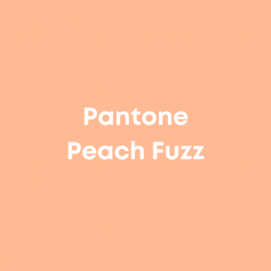
Pantone: Peach Fuzz
Peach Fuzz, a soft and delicate hue nestled between pink and orange, commemorates Pantone’s 25th anniversary of the Color of the Year program. In their Color of the Year announcement, Pantone describes the color as a “velvety gentle peach whose all-embracing spirit enriches heart, mind, and body.” The color is a fresh peach shade with a vintage feel, redesigned to exude a modern vibe. This versatile tone effortlessly fits into both physical and digital spaces.
Benjamin Moore: Blue Nova
Blue Nova, a blend of blue with a touch of violet, creates a cosmic atmosphere to inspire adventure and invite the exploration of new experiences. While it complements neutrals well, the galaxy-inspired color also encourages consumers to experiment with different hues. To make a bold statement in your space, contemplate using this color on the ceiling in a dining room or applying it all over in a small powder bathroom.

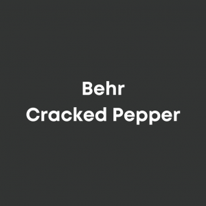
Behr: Cracked Pepper
Behr’s Cracked Pepper, a soft black, offers a timeless grounding effect for any space. This color serves as an approachable introduction to darker paints, seamlessly blending into various design styles. As an anchor color that doesn’t require reinvention, Cracked Pepper is an excellent choice for both interior and exterior painting projects.
Sherwin-Williams: Upward
Upward by Sherwin-Williams is a tranquil light blue, evoking the sensation of a leisurely breath of fresh air. Sherwin-Williams Director of Color Marketing, Sue Wadden, describes it as “capturing the carefree, sunny day energy that instills feelings of contentment and peace,” in their 2024 Color of the Year press release.
Upward invites consumers to infuse a sense of ease and possibility into their spaces, creating an atmosphere of meditation and tranquility. With its gray undertones, Upward is especially fitting for a coastal chic design style. Consider incorporating it as a standout color in bathrooms or kitchens, or use it to refreshingly accentuate a serene bedroom wall.

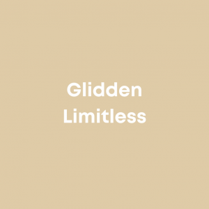
Glidden: Limitless
Glidden has unveiled Limitless as its Color of the Year for 2024. Described as a honey beige hue, Limitless is characterized by its unique blend of primary color stamina and neutral versatility. The color signifies a shift into a new era of creativity and change, reflecting consumers’ growing inclination for unconventional color usage. Offering adaptability to complement both new and existing decor, in its Color of the Year Announcement, Glidden color experts suggest incorporating Limitless “anywhere and everywhere” Whether applied to kitchen cabinets or ceilings, this warm neutral functions as a stylish but classic choice.
C2: Thermal
C2 Paint has unveiled Thermal as its Color of the Year for 2024 – a rejuvenating blue poised to inspire an uplifting and energizing year ahead. Creating the essence of a clear sky, this color can invite a calming ambiance into any space. Thermal is “a bespoke, soft yet vibrant blue that sparks a sense of adventure, instilling feelings of loyalty, trust, and confidence,” said Interior Designer and C2 Color Specialist Philippa Radon in their 2024 Color of the Year press release.
This gentle blue shade seamlessly blends into your decor, offering a subtle touch through throw blankets or pillows on neutral furniture. Consider giving your backyard patio set a vibrant makeover, adding a burst of liveliness to your outdoor space.

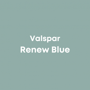
Valspar: Renew Blue
In celebration of its 15th anniversary in the Color of the Year tradition, Valspar introduces Renew Blue as its 2024 hue. Drawing inspiration from transient elements such as fog, mist, clouds, and glacier lakes, Renew Blue elevates everyday moods, fosters self-expression, and instills a sense of balance and calm.
This harmonious blue, touched with grayed sea green, stands out as an ideal choice for revitalizing spaces like entryways, dining areas, or backyards. Its timeless hue works as a contemporary neutral for homes, offering endless possibilities for mixing and matching to suit various design styles and applications.
HGTV Home by Sherwin-Williams: Persimmon
For those drawn to warm and vibrant tones, HGTV Home by Sherwin-Williams presents Persimmon, a captivating choice. Blending the lively energy of tangerine with grounded neutral undertones, Persimmon is an ideal selection for spaces like living rooms and kitchens. It not only imparts a welcoming atmosphere but also encourages positive relationships and meaningful conversations in these areas.
Whether adorning the walls or accentuating key elements in your home, this lively hue brings a burst of energy and a touch of grounded elegance. Picture it as a feature wall, a pop of color on your sofas, or even in your kitchen accessories. The versatility of Persimmon allows you to infuse your living spaces with personality and charm, creating an environment that resonates with warmth and style.

Dutch Boy Paints: Ironside
Dutch Boy Paints’ Ironside evokes a feeling of consistent comfort in your living space. Whether applied across expansive rooms or in more confined areas, this deep olive shade adds a touch of sophistication while embracing the concept of wellness.
In response to a growing trend, many consumers are actively incorporating wellness into their home spaces, recognizing its significance as a driving force in their daily lives. Overall wellness and the desire for safe spaces have become an integral aspect of the contemporary landscape, reflected in the popularity of warm, earthy colors.
If a complete room transformation isn’t on your agenda, consider experimenting with this versatile shade on trim or furniture for a subtle yet impactful integration of its calming and elegant essence.
